Why Your Traced SVG Is Bigger Than the PNG
Tracing does not un-rasterize an image. Here is what it actually does, why photos come out ten times larger, and when it genuinely works.
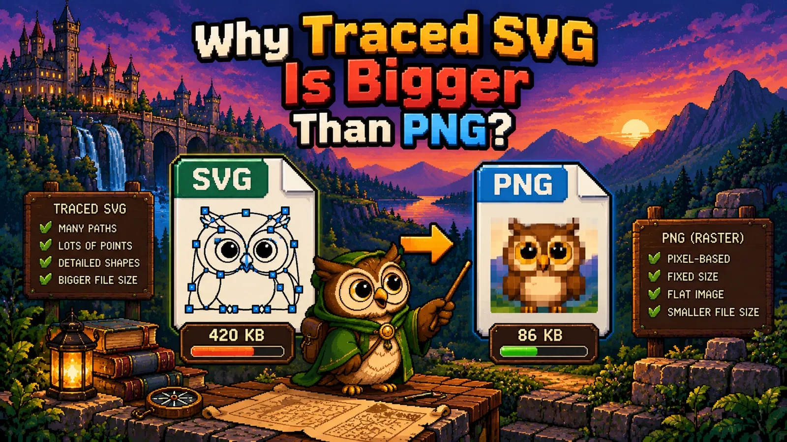
You trace a PNG to SVG expecting a small, clean, infinitely scalable file. You get something several times larger that looks slightly wrong. Nothing has gone wrong — that is what tracing does, and understanding why takes about two minutes and saves a lot of frustration.
Tracing is not the reverse of rasterizing#
The first thing to be clear about: converting a PNG to SVG does not recover the vector file it came from. That file, if it ever existed, is gone. Rasterizing throws away the shapes and keeps a grid of colours, and nothing reconstructs them.
What a tracer does instead is start from the pixels and invent new shapes. It groups pixels into regions of similar colour, then draws an outline around each region and fills it. The result approximates the picture. It is a new drawing that resembles the old one.
That distinction explains everything that follows.
Why the file gets bigger#
PNG and SVG pay for completely different things.
A PNG pays for pixels, cheaply. It compresses by finding patterns — a run of identical pixels costs almost nothing, a smooth gradient costs a bit more.
An SVG pays for boundaries, expensively. Every region needs its outline written out as coordinates. A single flat shape is a handful of numbers. A thousand small regions are a thousand outlines.
So the cost of an SVG scales with how many distinct regions the image has, not how many pixels. A logo has about six. A photograph has tens of thousands.
Here is the same relationship measured across three real files:
| Source | As PNG/JPG | Traced to SVG | Paths |
|---|---|---|---|
| Black logo, 400 x 400 | 7.7 KB | 1.9 KB | 4 |
| Flat 6-colour illustration | 6.3 KB | 16.2 KB | 120 |
| Photograph, 320 x 480 | 14.1 KB | 151.5 KB | 607 |
The logo gets smaller — four paths describe it completely, and it now scales to any size. The illustration roughly triples. The photograph balloons to more than ten times the original, and looks worse.
Why photographs are hopeless#
A photograph has no flat regions. Every part of it is a smooth gradation — skin tones, sky, shadow, blur. A tracer has to approximate all of that with flat shapes, which means either a few large shapes (and it looks like a poster) or thousands of tiny ones (and the file explodes). There is no setting that avoids the choice.
Meanwhile JPEG is extraordinarily good at exactly this. It stores smooth colour variation cheaply by discarding detail nobody notices. Asking an SVG to compete is asking the wrong format to do the one job it is worst at.
The gap is easy to spot in advance, because photographs and drawings differ enormously in how many distinct colours they contain. Measured across our three fixtures: the black logo had 244 distinct colours, the flat illustration 150, and the photograph 59,629. Three orders of magnitude. Our PNG to SVG and JPG to SVG tools count them and warn you before you wait.
The colour count is the control that matters#
If you only change one setting, change this one. On the same flat illustration:
| Colours | Output | Paths |
|---|---|---|
| 2 | 622 B | 2 |
| 6 | 18.9 KB | 141 |
| 8 | 16.2 KB | 120 |
| 16 | 24.2 KB | 185 |
Two colours produced a file thirty times smaller than sixteen. And note the row that is not monotonic: six colours produced a larger file than eight, because a slightly worse palette split one region into several. Quantization is not tidy, which is another reason to try a few settings and look, rather than assuming higher is better.
Start low. Raise it only while the preview visibly improves — which, for most flat artwork, stops well before you expect.
When tracing genuinely works#
It works when the source really is made of flat shapes:
- Logos and wordmarks, especially black-on-white
- Line art and scanned drawings
- Signatures and stamps
- Anything driving a cutting machine — vinyl cutters, laser engravers and embroidery software need paths, not pixels, so tracing is not an optimization here, it is the only way in
- A rough starting point for hand-editing in Illustrator or Inkscape
And it does not work for photographs, gradients, drop shadows, soft focus, or screenshots of text. Those all depend on smooth transitions, and flat regions cannot represent a smooth transition without either banding or an enormous number of shapes.
Two things that help a bad source#
If you are tracing something scanned or JPEG-compressed, two settings do most of the work:
Raise the minimum area. JPEG compression leaves faint blocky artefacts in what looks like plain white paper, and a tracer will faithfully outline every one. Discarding regions under 16 or 32 pixels usually cuts the path count sharply with no visible loss.
Increase the contrast before you trace. If the ink is properly black and the paper properly white, there are fewer intermediate greys, so fewer regions, fewer paths, and a smaller file. Five seconds in any image editor beats any amount of fiddling with tracer settings afterwards.
The short version#
- Tracing invents new shapes from pixels. It does not recover an original vector file.
- SVG size scales with the number of colour regions, not pixels — which is why logos shrink and photos explode.
- A photograph traced to SVG is typically ten times larger and worse-looking. Keep the original.
- Colour count is the setting that matters. Start at 2 and work up.
- For flat artwork the result is genuinely excellent: our test logo went from 7.7 KB to 1.9 KB and four paths, and now scales to any size.
Try the tools
Free, private, and instant. Everything runs in your browser.